
Website navigation plays a critical role in how users explore and interact with a website. When navigation is clear and intuitive, visitors can quickly find the information they need.
However, poor navigation can confuse users and cause them to leave a website before completing their goals.
By following website navigation best practices, designers can create websites that are easier to use and more effective at guiding visitors.
In this guide, we’ll explore:
- what website navigation is
- why navigation design matters
- common types of website navigation
- best practices for designing effective menus
Let’s look at how navigation helps users move through websites efficiently.
What Is Website Navigation?
Website navigation refers to the system of menus, links, and buttons that help users move between pages on a website.
Navigation elements usually include:
- main menus
- dropdown menus
- navigation bars
- internal links
These elements help users explore different sections of a website.
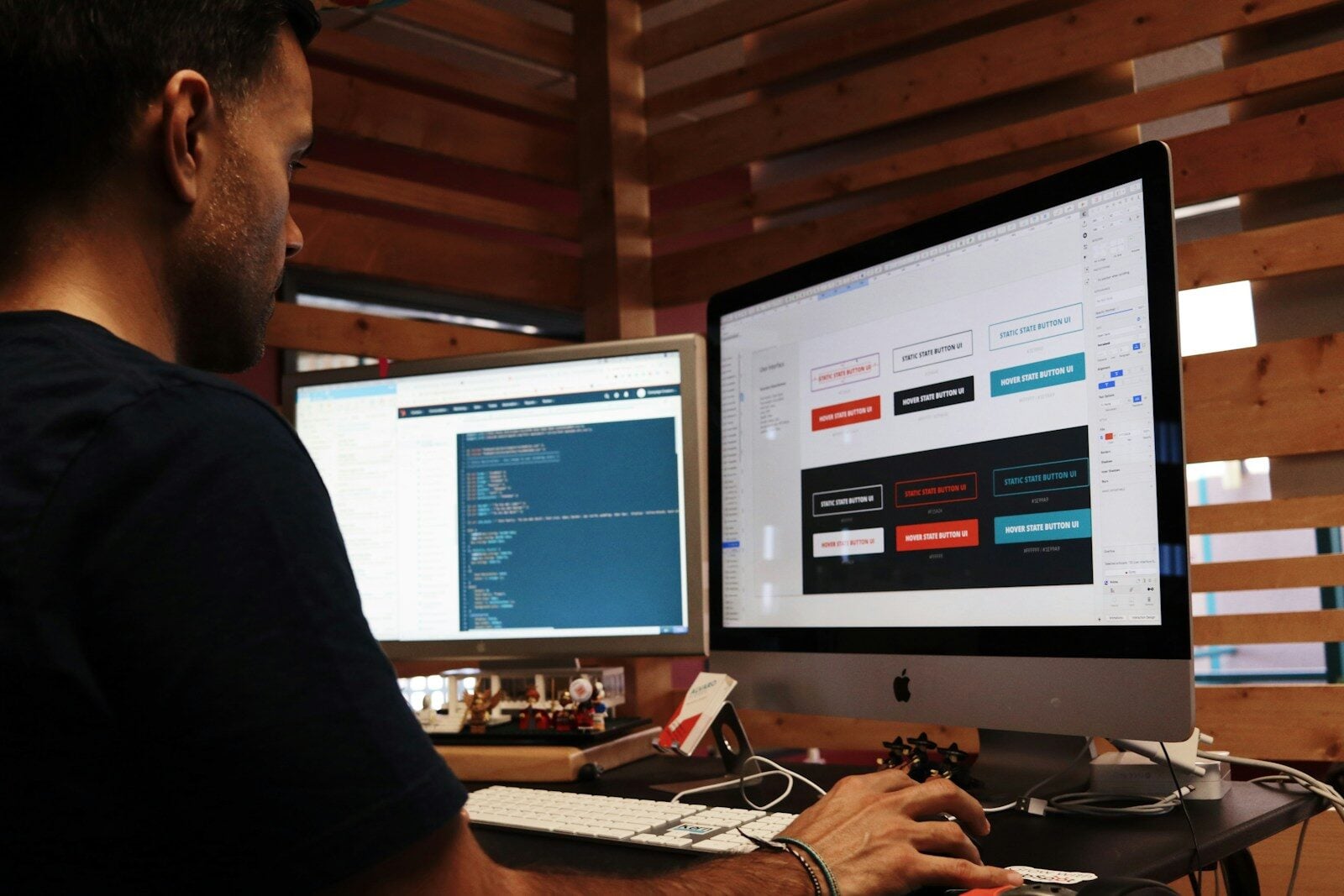
Designers often plan navigation structures during the design stage using tools like Figma before development begins.
A well-designed navigation system helps visitors quickly find what they need.
Why Website Navigation Is Important

Good navigation improves both usability and website performance.
Clear navigation helps:
- users find information quickly
- improve user engagement
- reduce bounce rates
- increase conversions
If visitors struggle to navigate a website, they are more likely to leave and visit a competitor’s site.

Common Types of Website Navigation
Websites often use several navigation types to help users explore content.
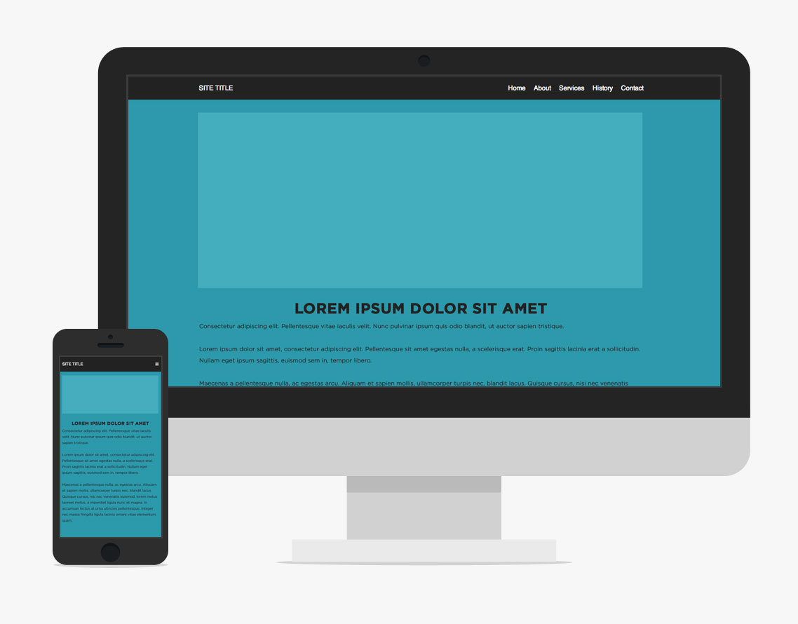
Top Navigation Bar
A horizontal navigation bar appears at the top of the page.
This is one of the most common navigation styles used on websites.
Sidebar Navigation
Sidebar navigation appears on the left or right side of the page.
It is often used on blogs, dashboards, and documentation websites.
Dropdown Menus
Dropdown menus allow websites to organize large amounts of content under one menu item.
They help reduce clutter in navigation bars.
Footer Navigation
Footer navigation appears at the bottom of a website and often includes links to important pages such as:
- contact information
- privacy policies
- support pages
Key Website Navigation Best Practices
To create effective navigation, designers should follow several best practices.
Keep Navigation Simple
Menus should contain only the most important links.
Too many options can overwhelm users.

Use Clear Labels
Menu labels should clearly describe the page they link to.
Avoid confusing or vague wording.
Maintain Consistent Navigation
Navigation should remain consistent across all pages of the website.
Consistency helps users understand how the site works.

Prioritize Important Pages
Place the most important links in the main navigation menu.
This ensures users can easily access key sections.
Mobile Friendly Navigation
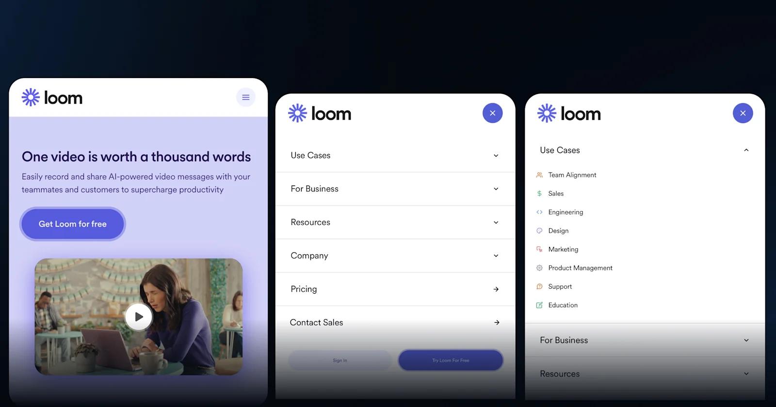
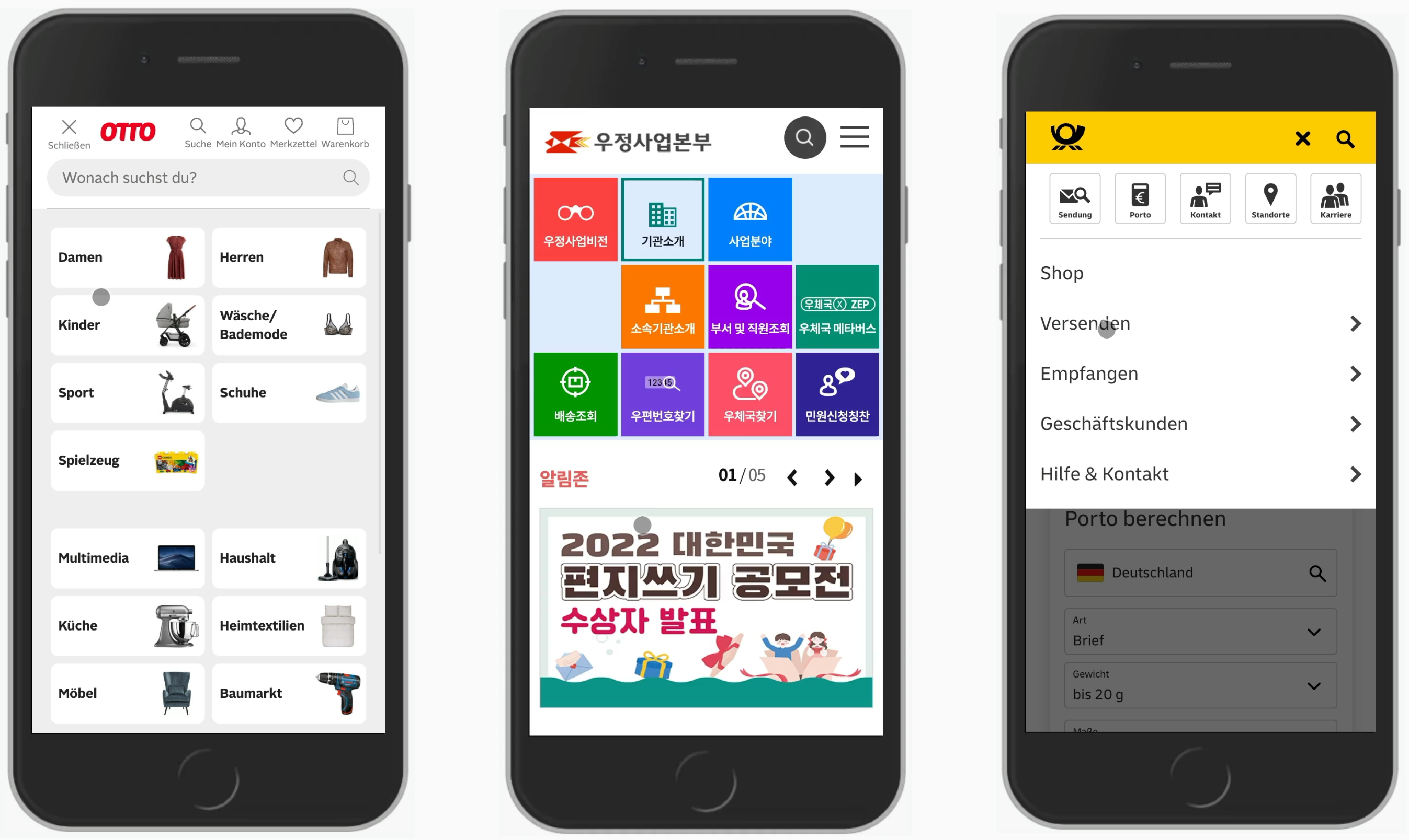
Because many users browse websites on mobile devices, navigation must be optimized for small screens.
Common mobile navigation solutions include:
- hamburger menus
- collapsible navigation bars
- touch friendly buttons
Developers often test responsive navigation layouts using browser tools like Chrome DevTools.
Mobile friendly navigation improves usability for smartphone users.
Common Website Navigation Mistakes
Even well-designed websites sometimes struggle with navigation issues.
Common mistakes include:
- too many menu items
- unclear navigation labels
- inconsistent menus across pages
- hidden navigation elements
Avoiding these problems helps improve user experience.
Tips for Designing Better Website Navigation
Here are several practical tips for improving website navigation.
Organize Content Logically
Group related pages together in navigation menus.
Limit Menu Items
Focus on the most important pages.
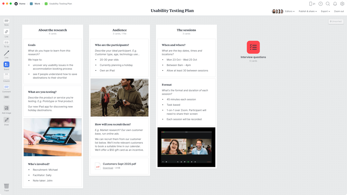
Test Navigation With Users
User testing can reveal navigation issues.
Use Internal Links
Internal links help users move through the website more easily.
Conclusion
Website navigation is one of the most important aspects of web design and user experience.
By creating clear menus, organizing content logically, and optimizing navigation for mobile devices, designers can help users explore websites more easily.
Strong navigation improves usability, increases engagement, and helps visitors find the information they need.
For any website, effective navigation design is essential for creating a positive user experience.

Related Articles
Latest Articles
-
Google Review Removal Service That Protects Your Reputation and Builds Trust

Can Negative Google Reviews Damage a Healthcare Organization? A sudden wave of negative Google reviews can seriously damage the reputation of a nursing home or medical practice. Families researching nursing homes often compare ratings, recent reviews, management responses, photographs, and overall review activity before scheduling a tour. Patients may perform the same research before choosing…
-
Google Review Management Agency That Helps Businesses Build Trust and Get More Customers

People trust Google reviews before they trust advertisements. Before contacting your business, potential customers usually search your company online and ask themselves one important question: “Can I trust this business?” That answer often comes from your reviews. Customers look at: If your business has weak reviews, outdated feedback, or unanswered complaints, customers may choose a…
-
How to Get New Patients in New York With Google Reviews

Your next patient in New York may decide whether to call your practice before ever speaking to your staff. Today, patients search, compare, and read reviews before choosing care. A 2025 survey found 84% of patients check online reviews before choosing a new healthcare provider. In 2026, 75% said they wouldn’t book with a provider…
✅