
Today, people access websites from many different devices, including smartphones, tablets, laptops, and desktop computers. Because of this, websites must be designed to adapt to different screen sizes. This approach is known as responsive web design.
Responsive web design ensures that a website automatically adjusts its layout, images, and content to fit any screen. A responsive site provides a smooth and consistent experience for users no matter which device they use.
In this guide, we’ll explore:
- what responsive web design is
- why mobile friendly websites are important
- key principles of responsive design
- tools and techniques developers use
Let’s look at how developers build websites that work across all devices.
What Is Responsive Web Design?
Responsive web design is a design approach that allows websites to automatically adapt to different screen sizes and devices.
Instead of creating separate websites for desktop and mobile users, responsive design uses flexible layouts that adjust dynamically.
Responsive websites use technologies such as:

- flexible grids
- fluid images
- CSS media queries
Developers typically build responsive layouts using languages like HTML, CSS, and JavaScript in coding environments such as Visual Studio Code.
Responsive design is now a standard practice in modern web development.
Why Responsive Design Is Important

Responsive design plays a major role in improving website usability and accessibility.
Key benefits include:
- better user experience across devices
- improved mobile usability
- higher search engine rankings
- reduced website maintenance
Search engines like Google Search prioritize mobile friendly websites in search results.
This makes responsive design essential for SEO.
Key Principles of Responsive Web Design

Several principles help developers create responsive websites.
Flexible Grid Layouts
Responsive websites use flexible grids that automatically adjust content based on screen size.
This allows page elements to resize proportionally.
Fluid Images
Images must scale properly on different devices.
Developers often use responsive image techniques to ensure images remain clear without slowing down the website.
CSS Media Queries
Media queries allow developers to apply different styles based on screen size.
This ensures that layouts adapt to smartphones, tablets, and desktops.
Mobile First Design Approach
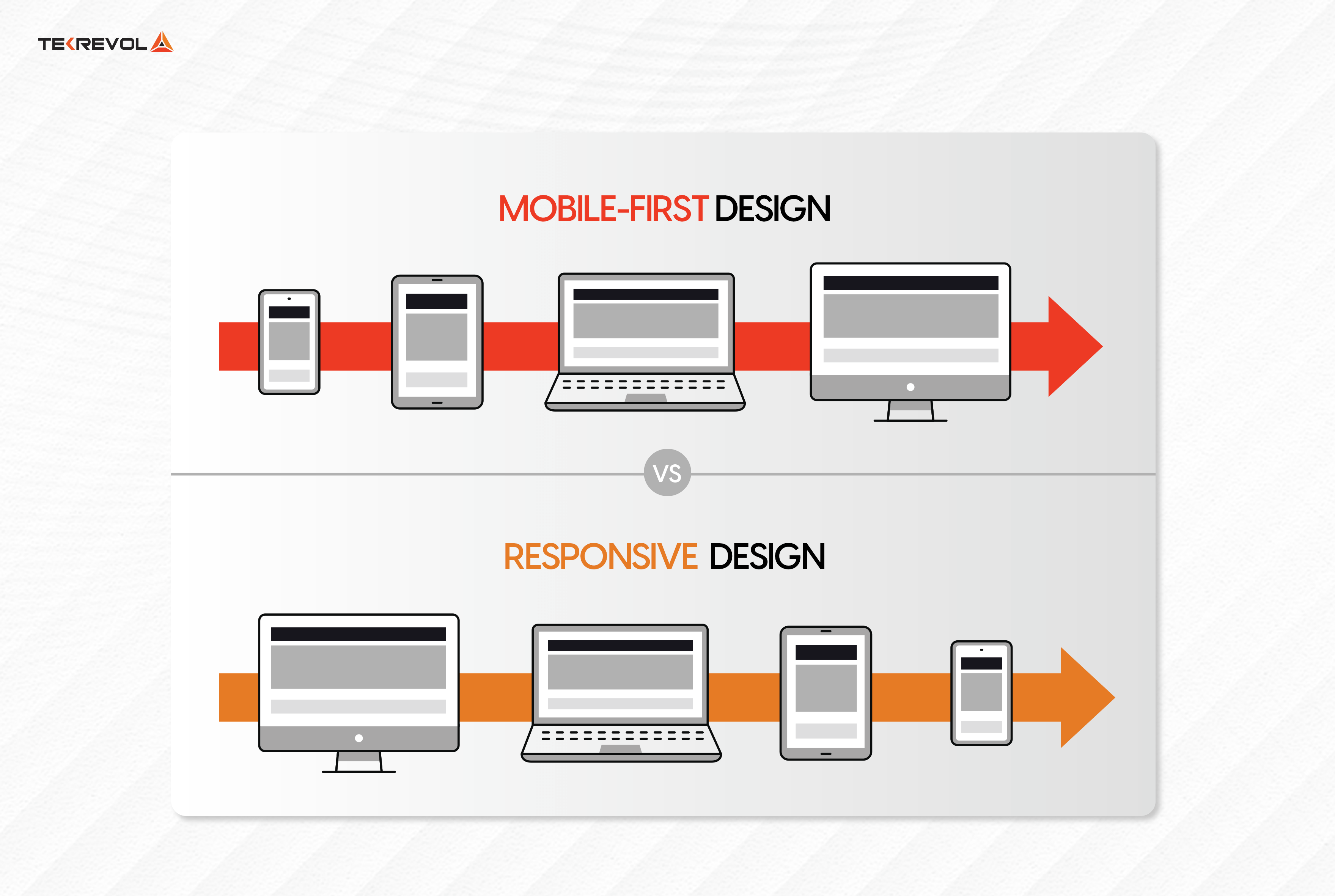
Many developers follow a mobile first design approach.
This means designing the website for smartphones first and then expanding the layout for larger screens.
Mobile first design ensures that the most important content remains accessible on small screens.
It also improves website performance and usability.
Tools for Responsive Web Design

Developers use several tools to test responsive layouts.
Popular tools include:
- Chrome DevTools for testing responsive layouts in browsers
- Figma for designing responsive UI layouts
- Bootstrap for responsive frontend frameworks
These tools help developers ensure websites function correctly across devices.
Common Responsive Design Mistakes
Even experienced developers can encounter challenges when designing responsive websites.
Common mistakes include:
- fixed width layouts that do not scale
- oversized images slowing down mobile pages
- poor navigation on small screens
- ignoring mobile performance
Avoiding these issues helps improve the overall user experience.
Tips for Creating Responsive Websites
Here are several helpful tips for developers.
Use Flexible Layouts
Avoid fixed dimensions that prevent layouts from adapting.
Optimize Images
Compressed images help improve mobile loading speed.
Test Across Devices
Always test websites on multiple screen sizes and browsers.
Prioritize Mobile Usability
Ensure buttons, menus, and text remain easy to use on smartphones.
Conclusion
Responsive web design is essential for building modern websites that work across all devices.
By using flexible layouts, fluid images, and CSS media queries, developers can create websites that adapt to different screen sizes automatically.
Responsive design improves user experience, increases accessibility, and helps websites perform better in search results.
For developers and businesses alike, building responsive websites is now a fundamental part of successful web development.

Related Articles
Latest Articles
-
Google Review Management for Brooklyn Nursing Homes: A Complete Guide to Building Trust and Growing Your Reputation
When families begin searching for a Brooklyn nursing home, they almost always start online. Before making a phone call or scheduling a tour, they read Google reviews to learn about other families’ experiences. Positive feedback can reassure prospective residents, while unanswered negative reviews may raise concerns. Google review management has become one of the most…
-
Google Review Management Brooklyn | How To Get More 5-Star Reviews & Local SEO Success
Google Review Management for Brooklyn Businesses Your Google reviews can make the difference between gaining a new customer or losing them to a competitor. Whether you own a restaurant in Williamsburg, a dental practice in Park Slope, a contractor serving Bay Ridge, or a retail shop in Downtown Brooklyn, customers are reading your reviews before…
-
Improve Local SEO With Better Reviews for Your Service Business
Service businesses run on trust. Before customers book a contractor, plumber, electrician, roofer, HVAC company, cleaning service, landscaper, or repair professional, they usually check Google reviews first. They want to know:Can this company be trusted?Do they show up on time?Are they professional?Do they communicate well?Do past customers recommend them?That is why Google review management for…
-
How Does Google’s New Search Engine Affect My Google Reviews? 7 Important Changes Every Business Should Know
How Does Google’s New Search Engine Affect My Google Reviews? Businesses that understand how reviews influence rankings are better positioned to adapt to Google’s AI-powered search experience. Instead of showing only a list of websites, Google now uses artificial intelligence to answer questions directly inside search results. For local businesses, this creates a big question:…
-
SEO Service Page Optimization: How Google Reviews and Local SEO Help You Rank Higher and Get More Customers
Connecting service pages to your Google Business Profile helps improve local search visibility, relevance, and lead generation. When each service listed in your profile links to a dedicated service page, potential customers can find detailed information, build trust, and take action, resulting in more calls, form submissions, and qualified local leads. Why Google Reviews Matter…
-
7 Google Customer Review Strategy Techniques That Will Increase Revenue
Your online reputation can influence almost every customer decision. Before calling a business, scheduling a consultation, or making a purchase, most consumers check Google reviews first. That’s why having a strong Google customer review strategy is no longer optional for businesses that want long-term growth. Google reviews affect more than reputation. They influence local search…