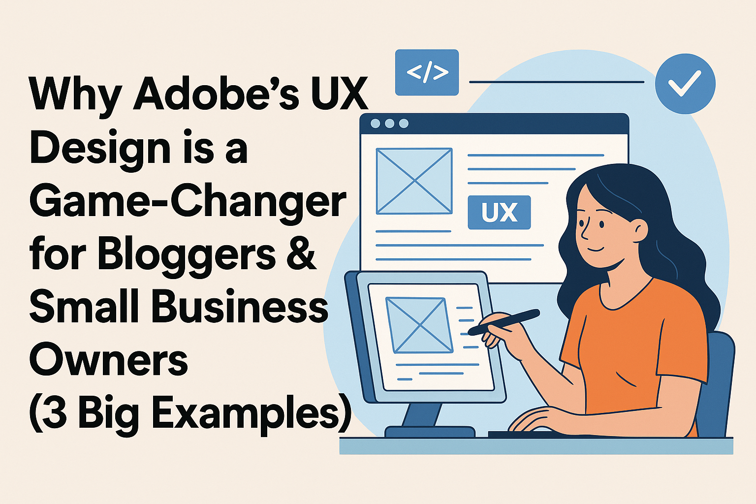
What is Adobe’s UX Design?
When you visit a website, do you notice how easy or hard it is to use? That’s called User Experience (UX). UX design makes sure websites and apps are simple, clear, and fun to use.
Adobe’s UX design tools help creators, bloggers, and business owners make better websites. Even if you use a drag-and-drop builder like Wix or Squarespace, Adobe tools can help you plan and design like a pro.

Understanding UX Design
UX design means thinking about the person using your site. Will they get confused? Can they find what they need fast? If yes, you’re doing it right. Adobe helps with this.
Why Adobe is a Leader in UX Tools
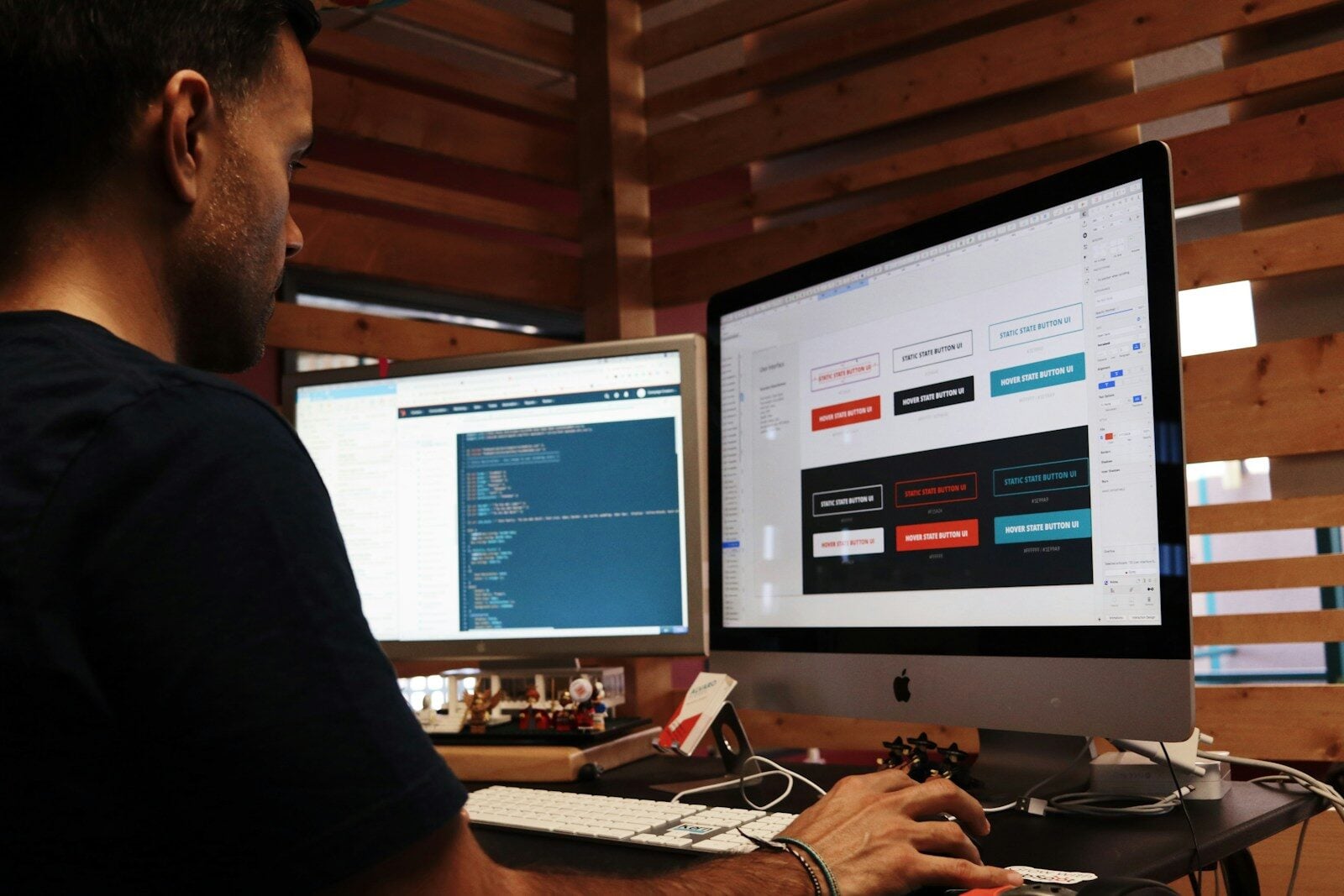
Adobe is famous for programs like Adobe XD, which lets you plan how a website looks and feels. It helps you test your ideas before you put them on your real website.
How Adobe’s UX Design Helps Business
Great design = happy visitors = more sales or readers. Here’s how Adobe’s UX design helps:
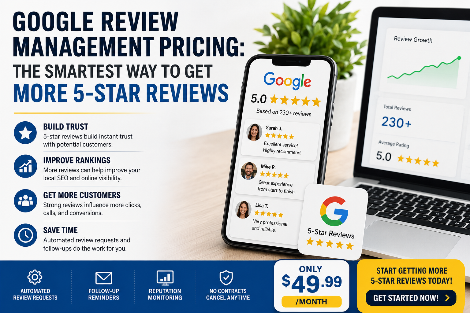
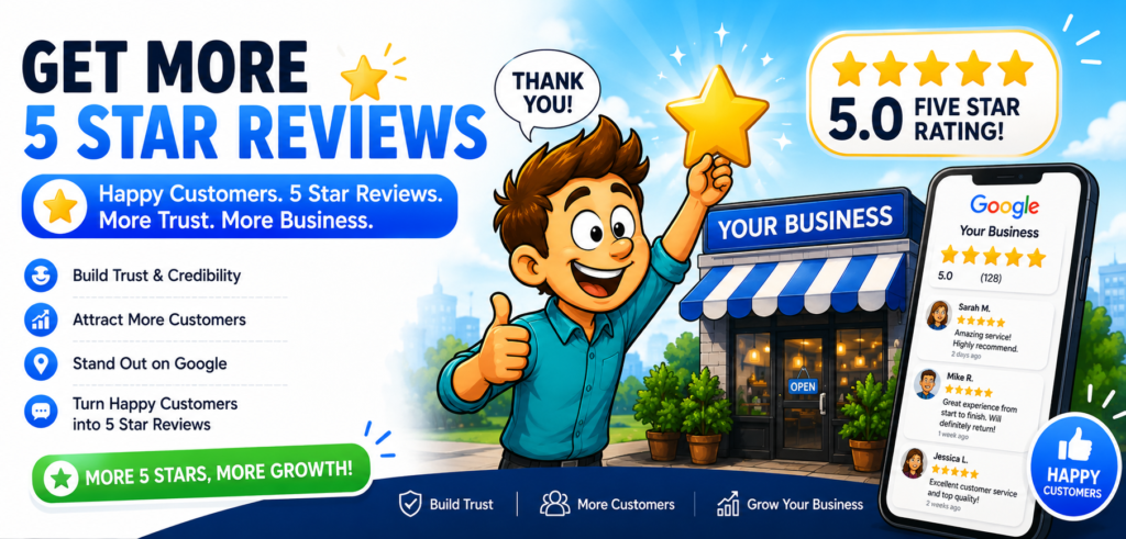
Builds Trust Through Easy Design
A clean and smooth site makes people feel safe. That trust helps turn visitors into customers.
Saves Time with Smart Features
You can use Adobe to build fast mockups and test different designs. No more guessing. It’s smart and saves time.
Adobe’s Tools for UX Design
Here are a few tools Adobe offers for UX design:
Adobe XD
Perfect for wireframing, prototyping, and testing website flows.
Adobe Illustrator
Helps create logos and icons that fit your site’s theme.
Adobe Photoshop
You can edit images and banners to look sharp and professional.
UX Design for Drag-and-Drop Builders
Many people use builders like:
- Wix
- Squarespace
- Shopify
Even these need good design. Adobe tools help you plan layouts and move them into your builder.
Making Templates Look Better
Use Adobe to adjust colors, buttons, and fonts so your site stands out.
Custom Layouts Without Code
Adobe XD helps you design pages first, then build them with drag-and-drop tools later.
🍽️ How Food Bloggers Can Use Adobe UX to Stand Out
Food blogs thrive on beautiful visuals, easy-to-follow recipes, and smooth browsing. Great UX design for food blogs isn’t just about looks—it’s about creating a seamless experience that keeps readers engaged and coming back for more.
Here’s how food bloggers can use Adobe UX tools to elevate their content:
📝 Better Recipe Layouts = Better Engagement
Messy recipe formats can frustrate readers. Clean, structured sections for ingredients, steps, and prep time make a big difference.
Use Adobe XD to design and test your recipe page layout before publishing. You can create wireframes with drag-and-drop elements, organize your content by hierarchy, and simulate how readers will scroll through the page.
✅ Pro Tip: Highlight cooking times and serving sizes at the top for fast scanning—just like top-performing recipe blogs do.
⚡ Faster-Loading Pages with Optimized Images
Food blogs are image-heavy, which can slow down your site if you’re not careful. Speed matters—pages that load in under 3 seconds see significantly lower bounce rates.
Use Adobe Photoshop to compress high-resolution food photos without sacrificing quality. Combine that with tools like TinyPNG or export in WebP format to keep your blog running fast and smooth.
🔍 Stat: According to Google, page speed is a ranking factor, and 53% of mobile users leave sites that take longer than 3 seconds to load.
👨🍳 UX Design = Recipe Success
With Adobe tools, you can go beyond basic blogging. Build an experience that feels curated and professional. From hover animations on recipe categories to scroll-triggered interactions, Adobe lets you design a food blog that works as well as it looks.

💡 UX Tips for All Bloggers
No matter what kind of content you create—recipes, reviews, travel guides, or tutorials—user experience (UX) design plays a huge role in how visitors engage with your blog. A great blog isn’t just about good writing—it’s about creating an intuitive, enjoyable experience that keeps readers coming back.
Here are some smart UX tips all bloggers can use—along with how Adobe’s design tools can help.
1. ✨ Use White Space Strategically
Why it matters: White space (also called negative space) makes your layout easier on the eyes. It improves visual hierarchy, guiding readers to key elements like CTAs and headlines without overwhelming them.
How to do it:
Use Adobe XD or Illustrator to mock up different layouts and spacing variations before you go live.
✅ Pro Tip: Don’t cram too many elements above the fold—let your content breathe.
2. 🔠 Make Text Easy to Read
Why it matters: If your font is too small or too decorative, people won’t read it—no matter how good your content is. Readability directly impacts bounce rate and time on page.
How to do it:
Use Adobe Fonts inside XD or Photoshop to test font pairings, weights, and line heights. Stick to clean, modern typefaces like Lato, Roboto, or Source Sans.
✅ Pro Tip: Keep body text between 16–18px, and use clear contrast between text and background.
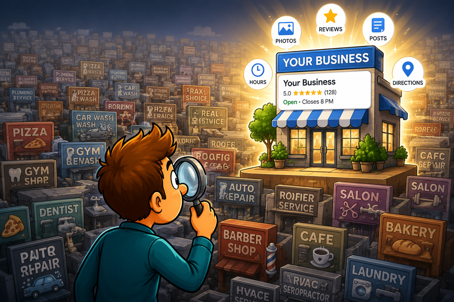
3. 🧭 Simplify Navigation
Why it matters: Confusing menus = lost visitors. UX studies show that users should find what they need within three clicks.
How to do it:
Use Adobe XD’s prototype linking to map out your menu structure. Test user flows before publishing.
✅ Pro Tip: Group similar topics together and label menu items clearly (e.g., “Recipes” vs. “Food”).
4. 📷 Use High-Quality, Optimized Images
Why it matters: Sharp, relevant visuals boost trust, especially in blog niches like food, fashion, and travel.
How to do it:
Use Adobe Photoshop to resize, compress, and color-correct your images without losing quality. Include descriptive alt text for SEO and accessibility.
✅ Pro Tip: Aim for image sizes under 200KB and use WebP format when possible.
5. 🧪 Test and Iterate
Why it matters: The first version of your site won’t be perfect—and that’s OK. A/B testing different layouts and CTA styles improves conversion rates over time.
How to do it:
Run split tests using tools like Google Optimize, and visualize layout tweaks in Adobe XD before deploying.
✅ Pro Tip: Test different placements for email signups or affiliate banners—small shifts can mean big results.

🔍 Real Examples of Adobe UX Design in Action
Adobe’s suite of UX tools—like Adobe XD, Illustrator, and Photoshop—help creators design better digital experiences that don’t just look great, but convert better too. Below are real-world examples of how bloggers, creators, and online business owners used Adobe UX design to drive engagement and performance.
🍳 1. Food Blog: UX Wins with Adobe XD Prototyping
A recipe blog used Adobe XD to build wireframes and run user flow simulations. Their heatmap testing revealed that users were scrolling too far to find the “Print Recipe” button. Using XD’s intuitive UI layout features, they moved the CTA to the top of the recipe card.
Result: Clicks on “Print Recipe” more than doubled—and bounce rates dropped by 18%.
UX Takeaway: Prototyping tools like Adobe XD help designers test interactions and refine layout hierarchy before launch.
✈️ 2. Travel Blog: Visual Hierarchy with Illustrator
A solo travel blogger revamped her site using Adobe Illustrator to create custom icons, maps, and illustrations. She used semantic UX principles like visual cues and consistent navigation to turn each post into an interactive journey. The blog now feels like exploring a map, complete with waypoints and image markers.
Result: Time on site increased by 40%, and users visited more pages per session.
UX Takeaway: Enhancing visual hierarchy with custom graphics makes content more immersive and intuitive to navigate.

🛍️ 3. Online Store: UI Makeover with Photoshop
A small e-commerce shop selling handcrafted goods used Adobe Photoshop to improve the visual quality of its product photos. By optimizing backgrounds, lighting, and adding subtle shadows, the team improved both aesthetic appeal and brand consistency.
Result: After updating product pages, conversions rose by 20%, and cart abandonment dropped.
UX Takeaway: Clean, cohesive product visuals improve user trust and influence purchase behavior—key aspects of effective eCommerce UX.
Why These UX Changes Worked
These creators used Adobe’s tools not just for aesthetics, but to optimize user experience design at every level. From wireframes and usability testing in Adobe XD to creating clear visual hierarchy with Illustrator and high-converting image design in Photoshop, Adobe’s ecosystem empowers you to build smarter.
Stats About UX and Business
What the Data Shows
- 88% of users won’t return to a site after a bad experience (Source: WebFX)
- 70% of businesses that improve UX see a boost in sales (Source: Forrester)
Why UX Matters More Than Ever
With more people online, your design can make or break your blog or store.
Where to Learn Adobe’s UX Design
Free Courses
- Adobe Learn
- Coursera has UX courses from top schools
Adobe’s Official Guides
Visit Adobe’s UX Design Resource Center
Best Practices for Using Adobe UX
Keep It Simple
Don’t overload your site. Less is more.
Test Often
Use Adobe XD to check if your design really works.
Design for Mobile
More people browse on phones. Adobe helps you make your site mobile-friendly first.
FAQs About Adobe’s UX Design
Q1: Do I need coding skills to use Adobe UX tools?
Nope! Tools like Adobe XD are made for everyone—even beginners.
Q2: Can I use Adobe with Wix or Shopify?
Yes! Design in Adobe, then apply it using drag-and-drop builders.
Q3: Is Adobe UX good for small blogs?
Absolutely! Even a small blog can benefit from clean design and layout.
Q4: What’s the cost of Adobe tools?
Adobe XD has a free version. Other tools like Photoshop start at $20.99/month.
Q5: Does Adobe help with SEO?
Yes! Fast-loading pages and smart layouts help SEO a lot.
Q6: Can kids learn Adobe UX?
Yes, many YouTube videos and classes make it easy—even for middle schoolers.
Conclusion
Adobe’s UX design is a secret weapon for bloggers and small businesses. Whether you run a recipe blog or an online shop, Adobe helps you create better user experiences. It works with drag-and-drop builders and gives you pro-level tools to shine.