
Introduction to anticipation in UX
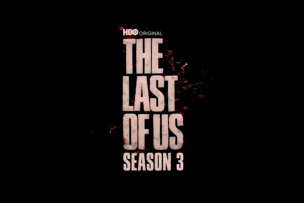
Background: HBO’s teaser campaign for The Last of Us Season 3
HBO’s slow-build promotional strategy taps into human psychology: give just enough info to hook fans, then drip-feed more.
- Teaser landing pages: Stark, minimal pages showcasing logo visuals and cryptic taglines.
- Countdown timers: Clock ticks toward major reveals—trailers, release windows, and more.
- Progressive content loading: Over time, HBO updates the page with images, cast info, and behind‑the‑scenes hints—rewarding repeat visits and sustaining buzz.
In today’s digital landscape, anticipation isn’t just reserved for blockbuster TV shows—it’s a powerful UX design strategy. Just as HBO has carefully orchestrated the teaser campaign for The Last of Us Season 3 (scheduled for 2027), savvy web designers leverage similar techniques—teaser pages, countdown timers, progressive reveals—to evoke curiosity, increase engagement, and build brand momentum from the very first click.

Trend 1: Teaser Landing Pages in Web Design
The concept of teaser landing pages has become increasingly central in UX design across various industries. These are minimalistic web pages launched before a major event, product, or content release—often containing a captivating image, a succinct message, and a prompt to engage (like an email signup).
Examples from Entertainment and Tech
Companies like Apple, Netflix, and even indie game developers use teaser landing pages to ignite anticipation. For instance:
- Apple’s product reveals often start with a “We have something special for you” page—mysterious, elegant, and shareable.
- Netflix might roll out a “Coming Soon” page for a series, featuring a black screen, a faint soundtrack, and cryptic visuals.
UX Benefits: Curiosity, Retention, Conversion
Here’s how teaser landing pages enhance UX:
- Curiosity Amplification: Users stay longer trying to decipher clues.
- Emotional Engagement: Teasers generate anticipation, which increases emotional investment.
- Retention & Conversion: Clear CTAs (email alerts, countdowns, pre-orders) drive higher engagement and user return rates.
The key is minimalism with intent. The fewer the words and the bolder the message, the more powerful the impact—provided it’s paired with a promise or mystery worth solving.
Trend 2: Countdown Timers Across Industries
Countdown timers may seem like simple widgets, but their psychological effect is profound. When users see a timer ticking down, they subconsciously experience urgency and excitement, which compels action.
Psychological Triggers: Urgency & FOMO
Psychologists identify this effect as temporal scarcity—the idea that time-limited availability increases perceived value. Countdown timers ignite:
- FOMO (Fear of Missing Out): “What if I miss this drop?”
- Urgency: “I should sign up now before it’s too late.”
This technique is especially effective in:
- E-commerce (flash sales)
- Event ticketing (limited availability)
- SaaS launches (early bird offers)
Implementation Best Practices
To maximize UX and conversions:
- Design with clarity: Use large, readable fonts and high-contrast colors.
- Be specific: “New Trailer Drops In: 03:02:15:21” is more engaging than “Coming Soon.”
- Pair with interactivity: Add an “Email Me the Moment It Launches” CTA.
Timers are not just visuals—they’re emotional hooks. Used correctly, they drive traffic, conversions, and loyalty.
Trend 3: Progressive Content Loading & Lazy Reveals
Another UX trend inspired by HBO’s teaser campaign is progressive content loading, also known as lazy loading or content staging. Instead of loading an entire page all at once, content is revealed bit by bit—often triggered by scrolling, time on page, or user interaction.
Techniques Like Skeleton Screens and Gradual Reveal
Some of the most popular methods include:
- Skeleton screens: Placeholder outlines show users where content will appear.
- Lazy loading images: Content only loads when it’s about to enter the viewport.
- Staggered reveals: Text and visuals fade or slide in as users scroll.
These techniques make the web feel alive—engaging users like a well-edited film trailer.
Balancing Performance With Storytelling
Progressive content loading isn’t just for aesthetics:
- Performance: It improves load times by deferring non-critical assets.
- Engagement: Keeps users intrigued, guiding them down the content funnel.
- Narrative: Lets you build a story piece by piece, as HBO does with each new teaser update.
But overuse can frustrate users. Designers must balance allure with efficiency, ensuring that interaction always leads to value—not just another cliffhanger.

Integration of Teaser Strategies in Product Design
Onboarding Flows with Anticipation Phases
Great onboarding doesn’t show all features at once. Instead, the most effective apps and platforms:
- Unveil features gradually: Introducing new elements only after users complete specific actions.
- Gamify the experience: Use progress bars, checklists, and visual cues to create mini milestones.
- Surprise and delight: Offer hidden rewards or “easter eggs” to sustain curiosity and build anticipation.
For example, mobile fitness apps might only show the next set of features (like meal tracking or sleep monitoring) after a user completes their first workout week—making progress part of the narrative.
The anticipation tactics used by entertainment giants like HBO aren’t confined to media—they’re increasingly relevant in product and software design. Applying teaser UX strategies in digital products can guide users through meaningful journeys and deepen emotional engagement.

E-commerce “Upcoming” Launches
Online retailers now leverage teaser mechanics to drive pre-launch buzz:
- “Notify Me” Buttons: Allow customers to register interest in unreleased items.
- Drip-feed product specs: Reveal design sketches, material choices, or influencer previews leading up to the launch.
- Exclusive early access: Offer sneak peeks to newsletter subscribers or loyalty members.
This strategy mirrors TV show teasers by rewarding fan loyalty while subtly encouraging conversions before a product even hits the shelf.
One Smart Ecommerce Switch That Saved My Business Time and Money
Measuring Anticipation: Metrics & KPIs
Creating anticipation is an art—but proving its ROI requires science. Brands need to track both quantitative and qualitative data to measure success.
Engagement Rates, Dwell Time, Conversions
Key performance indicators (KPIs) to watch:
- Bounce Rate: Are users leaving teaser pages too quickly?
- Dwell Time: How long are users staying?
- Return Visits: Are users coming back for updates?
- Conversion Rates: How many sign-ups or pre-orders are driven by teaser pages?
Tools like Google Analytics, Hotjar, and Mixpanel can provide heatmaps and funnel analysis to track user behavior on teaser experiences.
Qualitative Feedback: Surveys & Sentiment
It’s also important to understand how users feel:
- Micro-surveys: Pop-ups asking “Was this page helpful?” or “What do you hope to see next?”
- Social Media Listening: Track brand mentions, hashtags, and sentiment to gauge excitement or fatigue.
- Email Engagement: High open/click rates on teaser campaign updates signal rising interest.
These insights help refine future teaser strategies, ensuring that hype is balanced with value.
Overcoming Challenges and Risks
While anticipation UX can be powerful, it comes with pitfalls if not executed thoughtfully.
Managing User Frustration and Drop-Off
Common risks include:

- Unclear timelines: Users get frustrated if they don’t know when the payoff is coming.
- Lack of substance: Over-teasing with minimal content can feel manipulative.
- Too many updates: Users may lose interest if teaser phases drag on or feel repetitive.
Solutions:
- Be transparent about timelines or offer countdowns.
- Ensure each reveal adds meaningful value.
- Use feedback to gauge if the campaign should accelerate or adapt.
Aligning Hype With Real Delivery
Nothing destroys trust like a letdown. Teaser campaigns must align with product quality. If the final product (or episode) doesn’t live up to the hype, users may feel misled.
Design teams should:
- Test product readiness before launching teaser efforts.
- Over-deliver at the end—surprise users with more than promised.
- Create post-launch content that sustains momentum and deepens loyalty.
Future-Proofing Anticipation-Driven UX
As technology evolves, so will the way we build anticipation. Forward-thinking designers are already exploring AI and behavioral analytics to tailor teaser experiences.
AI-Powered Personalized Countdowns
Imagine landing on a teaser page and seeing:
“Hey Jamie, only 2 days left until your exclusive invite!”
By leveraging cookies or login data, sites can personalize countdowns based on user timezone, signup date, or engagement level—making the experience feel tailored and urgent.
Adaptive Content Reveals Based on Behavior
Future teaser experiences may adapt in real time:
- More engagement = faster reveals
- High click-through = unlock bonus previews
- Abandonment signals = offer incentives to return
This approach ensures users stay hooked without feeling trapped, offering a more ethical and enjoyable form of digital anticipation.
Foundational SEO AI: How to Outsmart Competitors with Data-Driven Strategy

Conclusion
The marketing and design playbook used for The Last of Us Season 3 highlights a timeless truth: anticipation drives engagement. Whether it’s the slow-burning tension of a teaser trailer or the intrigue of a countdown timer on a website, designing for anticipation turns passive observers into active participants.
Web and product designers who borrow from this strategy—by crafting teaser landing pages, integrating countdowns, and implementing progressive content loading—tap into a deep human desire for resolution. Each step in the user journey becomes a part of the story, a breadcrumb trail leading to the big reveal.
To future-proof your strategy:
- Prioritize emotional design.
- Use metrics to guide pacing.
- Balance suspense with substance.
When done right, these methods not only boost traffic and conversions but also build brand loyalty and user excitement that lasts long after the campaign ends.
To dive deeper into how anticipation affects user psychology and conversion, check out:
- Nielsen Norman Group on Progressive Disclosure
- Baymard Institute’s UX Research on Teaser Elements
- Smashing Magazine’s Guide to Designing for Emotion
Frequently Asked Questions
What is teaser UX?
Teaser UX involves using visual cues, incomplete information, and time-based elements to create curiosity and drive user interaction—often in the form of teaser pages, timers, or content reveals.
Why use countdown timers?
Countdowns create urgency and spark emotional investment, encouraging users to return, sign up, or make a purchase before time runs out.
How to avoid fatigue from slow reveals?
Use clear timelines, deliver consistent value with each phase, and keep interactions meaningful. Avoid dragging out campaigns longer than necessary.
Can small businesses apply these techniques?
Yes! Simple tools like email signups, “Coming Soon” banners, and social media sneak peeks can help any business build anticipation without a massive budget.
What tools support teaser pages?
Popular options include Launchrock, Carrd, Webflow, Unbounce, and custom WordPress themes tailored for pre-launch and teaser content.
How long should a progressive reveal campaign last?
Typically 2–6 weeks. This time frame maintains excitement without risking user fatigue or attention drop-off.